Designed for where you aren’t

👋🏼
Products with limited scope and thought of where they live and…who they live with.
What makes a product approachable, hated, neutral? Imagine a kid’s room, where there’s a led color lamp that turns on with magnetic button which doesn’t connect. It’s a simple rounded square shape red color lamp which you wont expect to bring so much joy to that kid who loves to use that little magnet button. Now, imagine the toys that kid is surrounded with. Soft toys, cars, building blocks…go further and look at the silhouettes of each of those toys. Rounded, fluffy…something that is a delight to look at and hold.
Now… imagine if you could apply the similar feeling on the medical equipments sitting on the same child’s bedside. A pediatric home ventilator is doing the most important job in that room. It is also, visually the object that least belongs there. Matte grey housing, visible port labels, an alarm hierarchy in yellow and red. It looks like something that arrived from somewhere else and hasn’t been let in yet. That’s not an accident of style but accumulated result of design language built for one environment being used - unchanged.
Clinical form languages is not arbitary. The matte surface reduce glare under surgical lighting. The numerical displays prioritize precision readability over ambient legibility. The color-coded alarm hierarchies were calibrated over decades against clinical training and the visual density of hospital enviorenments, where multiple devices compete for attention simultaneously. That language is going real work in the context it was built for.
The problem isn’t that clinical form language is wrong. It’s that it was never designed to be portable and moving a device into a home. In a hospital, the device’s form language is reinforced by the environment around it; other devices, clinical infrastructures, clinically trained staff. Strip all of that away that device is only a signaling asset without any input, which could be possibly be clear and persistent os some serious issue but the one receiving is the parent or someone who is not clinically trained for it.
I looked at 3 devices to propose my argument
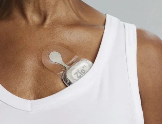
iRhythm Zio XT
The iRhythm Zio XT is worth examining because it made a deliberate and effective form language decision. The device was designed to disappear (my favorite kind of design language) and it does… 98% patient compliance and 83% of patients willing to wear it again are not just usability metrics; they’re evidence that the form language communicated something specific to the people living with it. iRhythm solved a harder problem than most manufacturers have attempted.
But the solution is worth examining more carefully. The design intelligence went into the making the device work but didn’t answer the problem of its domestic coexistence. This object that reads as domestic because it hides remains a largely unexplored medical device design approach.
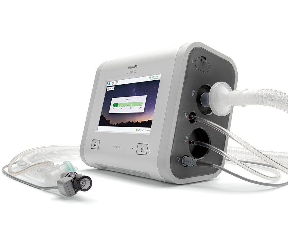
Philips Respironic Trilogy
The trilogy family of ventilators is genuinely sophisticated. The Evo’s 8” touch screen offers simplified displays for caregivers alongside detailed clinical redouts acknowledging 2 different users, with 2 different level of training, reading the same device at home. That’s a meaningful design decision.
The trilogy is explicitly positioned as a hospital to home device designed to maintain continuity across care environments. But would it have benefited with an layer of thought of a caregiver? A parent managing a child ventilator at home is not in a care environment imposed on it. Current form language of the device treats the hospital and home environment the same but i wonder what could it be, when there is an added lens of a caregiver.
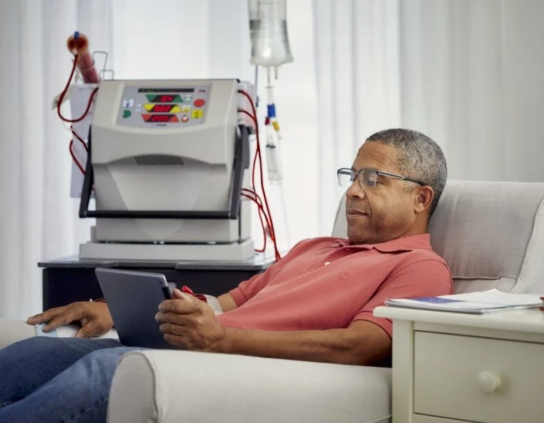
NxStage System One
NxStage is significant in comparison to home dialysis equipments. The System One is compact, portable, requires no water supply, occupies less living space, and reduces the need for home renovation. NxStage was able to remove the need to make any modification at home like plumbing, dedicated space and was first of its kind to for into domestic space without reorganizing it.
The interaction layer followed through. the drop-in cartridge system, the touchscreen guidance, the wipe-down disinfection protocol, all of it was built around a non-clinical user performing a complex procedure alone or with a caregiver partner. NICE’s review noted that the system mandates a caregiver be present, making this explicitly a 2 user product.
What the System One didn’t resolve is visible in the images of it actually installed in homes i.e the overall assembly reads as a treatment setup than an object that belongs there.
What neither machine fully resolved is form language, the overall visual impression of the object in the living room. The intelligence went into the interaction layer and the footprint which makes a fair sense. When a device is cleared for home use, the standard process adapts the instructions but rarely builds the object;s form language for the new context. FDA human factors such as HE75, IEC 62366 evaluates task performance and interface legibility but looses to evaluate the look and feel of that object in the room.
Designing medical devices for home use means asking not can be used here but what does the object say to the people who live with it.